Congratulations, you’ve shot your video and you’ve edited it. It looks amazing. Now it’s time to add titles. Titles make it really easy to introduce the video or people in the video for example. It’s also a representation of your brand so make it awesome. Here are a few pointers to help along the way.
Effective Video Titles
1. Choose your focal point
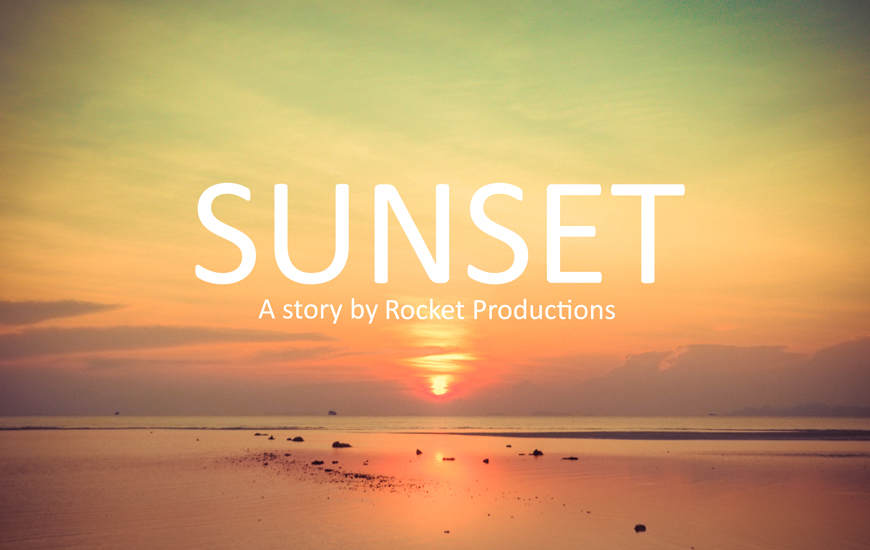
A focal point is the most important, attractive or interesting part of the image, the part that one’s eye instinctively focuses on first. All design needs a strong focal point to emphasise a particular element.Something that stands out and says ‘Hey, look here, this is our message!”. In the image above, the dominant focal point is the title. We’ll explain what the technical jargon means in just a second.
When designing your opening titles, you need to:
- decide what your message is,
- what parts of the message are most important, and
- how you are going to create that emphasis using the following principles.
Visual hierarchy is the arrangement of elements in order of importance. There are ideally 3 levels of dominance in visual hierarchy.
- Dominant – this is the element, such as the title, that is given the most emphasis
- Sub Dominant – elements with less emphasis than dominant elements
- Subordinate – elements given the least amount of visual emphasis and can even recede into the background to a degree.
Viewers should be able to look at your opening title and know within seconds which elements hold more importance, therefore, getting your message across clearly and effectively.
2. Get your sizing right
Scale is an important tool in creating dominance.
Remember, the sizing you decide on should always be relative to the other elements on the page and you should work on the sizing only once you have all elements to work with. There is no point in working on the sizing before this, as you will likely have to resize everything to fit with each other.
In the example below, you will see that the title ‘SUNSET’ is the most dominant and therefore most important.
Our eye is then led to the subtitle ‘A story by Rocket Productions’.
3. It’s all in the contrast
This is the visual difference between all the elements, whether it be different colours, sizes, shapes and so on. Contrast allows you to highlight key elements in your image.
In this example, we have used 2 methods to achieve contrast:
- Colour – we’ve made the font white so it pops more
- Size – we’ve make the title bigger than the subtitle for importance
4. Colour is in the eye of the beholder
Colour touches us on a basic, even primitive level.
We instinctively know that red generally conveys danger or anger, while yellow can invoke feelings of friendliness. Once you have decided on what your message is, it is important that you use colour for emotion.
In the above example, we used white to increase contrast, but sometimes you will find that high contrast doesn’t always quite convey your message. You can take the edge off by using complementary colours that already exist within the background image. In the new image below, we have used the lighter blue from the mountains and reduced the opacity slightly, so that it blends in to that soft feeling of the image.
5. Font it
While it is important that you use font to create contrast between your elements, it is also important that if you are using more than one font in your image, that you choose fonts that complement each other.
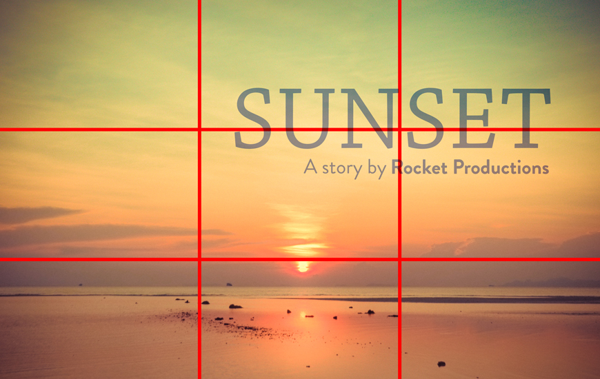
If you use a nice decorative font for your dominant element like ‘Sunset’ in our example, pair it with something a bit more neutral. In this example, we have use a serif font for this title (Chaparral Pro).
The size of the text should also affect what kind of font you choose, as all text needs to be legible. We’ve used a sans serif font for the sub title (Brandon Grotesque) and we have made the ‘Rocket Productions’ bold so that it is clear that that is more important than ‘A story by’.
Good typography makes a big difference between something looking refined and something that was thrown together.
6. Alignment is the spice of life
Humans are naturally attracted to symmetry.
A lack of symmetry can cause your layout to look messy and disorganised.
If you want to use an asymmetrical layout, you need to ensure that your alignment is perfect as it is something that will be noticed almost immediately, even if the viewer doesn’t realise what is actually wrong, only that something is not quite right.
In this example we are using right alignment and you will notice that the last letter on the bottom lines up exactly with the last letter on the top line. It’s a very simple adjustment that makes a design look professional.
7. Balance out all the elements
We can’t have a bright pink dominant title taking up the top half of the page and a lime green subdominant hiding in the bottom corner barely visible. We need balance in all aspects of our design, whether it be the font, colour, scale and so on.
If we can bring all of the above principles together we can effectively create a nice, balanced design. If once you have applied all of the above principles and are still not entirely happy with the result, there is one last little trick that can finish a design and leave it looking great. That is the Rule of Thirds.
The Rule of Thirds is a concept related to the Golden Rule and the Fibbonacci Sequence, but we won’t go into that today. Essentially, the Rule of Thirds is the method of splitting up a canvas/page/artboard into three equally sized horizontal sections and three equally sized vertical sections and the resulting grid gives you a sort of road map that you can use to place your elements on the page and know they will work.
You should place your elements on any cross section in the grid. Your message can even run over two cross sections but it shouldn’t run over more than two as this will just crowd the page.
In our example, we have focused on the top right third and have also reduced the size of the title text as I felt the balance was not feeling right.
One last tip
Before you jump on your computer and Photoshop away:
1. Choose your message
2. Choose your elements such as image and text
3. Decide what’s important
Now have fun. Look out for our next article on how to bring your titles to life with animation.
Melissa Russell is a Producer at Sydney based video production company, Rocket Productions. You’ll find more useful articles on our blog!


